Client: Southland Corporation (7-Eleven)
Category: Convenience Stores
Scope: logos, branding, food and beverage packaging, signage, photography
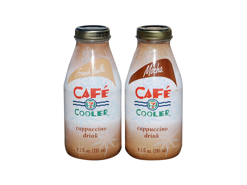
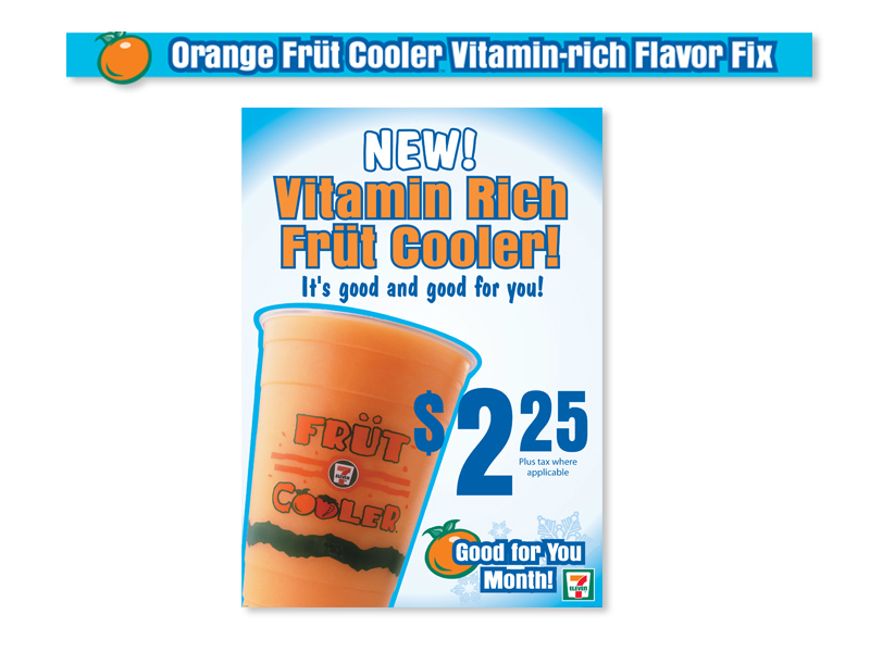
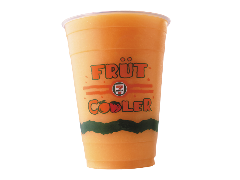
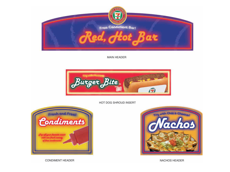
Project Objectives: Southland Corporation, the parent company of 7-Eleven®, Slurpee®, World Ovens®, and Deli Central™, was one of the largest accounts ’Berta worked on during her six year tenure in Dallas. From the beginning, ‘Berta was heavily involved with the Southland account: conceptualizing, designing, illustrating and producing work for projects including Slurpee translights, store display signage, food packaging, and cross-promotional programs. ’Berta and the Integer team partnered with the client’s in-house marketing department to drive the creative forward.
‘Berta’s Role
While working on the Southland account, ’Berta:
- nurtured a long-term relationship with the client by building trust and camaraderie.
- worked directly with the client-side marketing directors to meet their objectives.
- persuaded the client to update and upgrade the quality of their food photography, creating more appetizing visual images.
- worked closely with the client, ’Berta and the team successfully shaped the visual direction of Southland’s POP (point-of-purchase)—creating a unified theme for each monthly promotional period.
- was as an integral part of the Nexus, then the Integer team, applying the brand identity throughout a wide variety of projects/products, including monthly storage signage kits.
- created original illustrations and art directed photoshoots.
Final Results and Deliverables
’Berta’s close working relationship with the agency and client teams resulted in:
- a cohesive and extensive body of POP and store signage that created a high impact in-store environment for customers.
- a cohesive approach to keeping new messages front and center.
- more appealing food and beverage photography styling, which resulted in more compelling visuals to drive sales.
- the establishment of a long and familiar relationship with the client, leading to a successfully coordinated and managed account.
Grilled Food Station Signage
This signage system, reminiscent of the old-fashioned drive-in burger joint, enticed customers to try the variety of hot foods on offer.
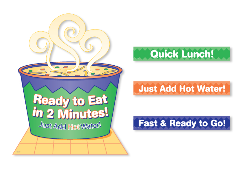
Hot Soup Station Signage
This signage system worked together to lend a cohesive look to the hot soup section with an illustrated display shelf sign and interchangeable rail strips.
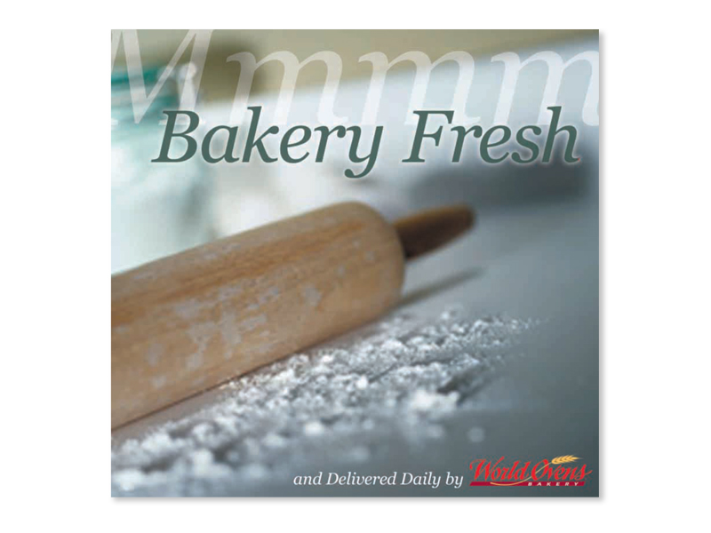
Pastry Case Header Card
This signage communicated fresh baked quality through better photography without necessarily having to show a particular product.
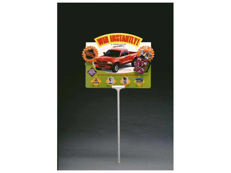
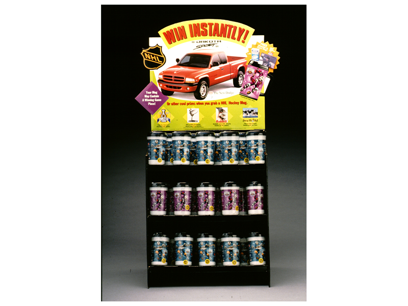
NHL Promotional Sweepstakes Signage
This cross-promotional mug display and gas pump sign were part of a sweepstakes promoting NHL season mugs, each containing a chance to win a Dodge Dakota or other prizes.
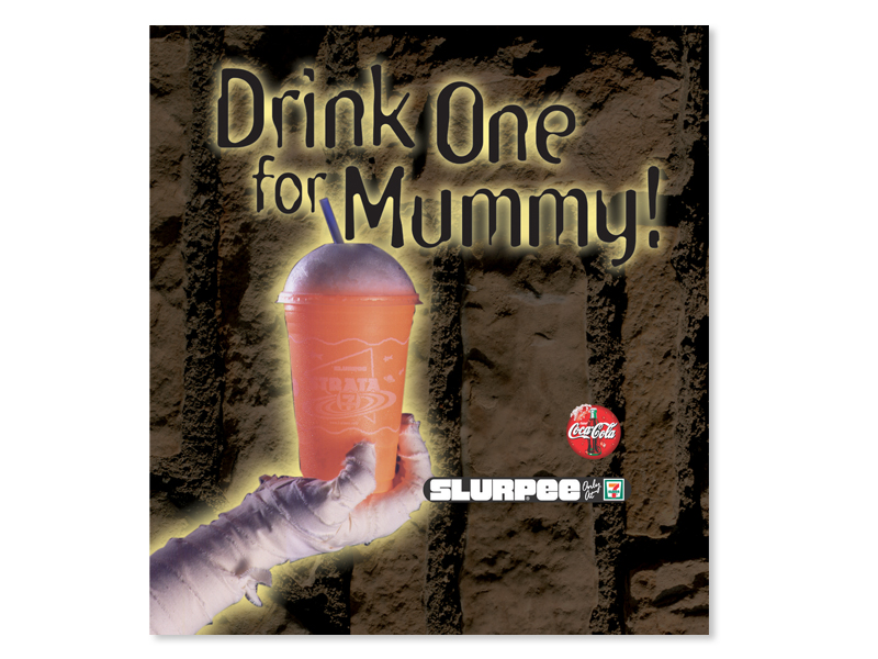
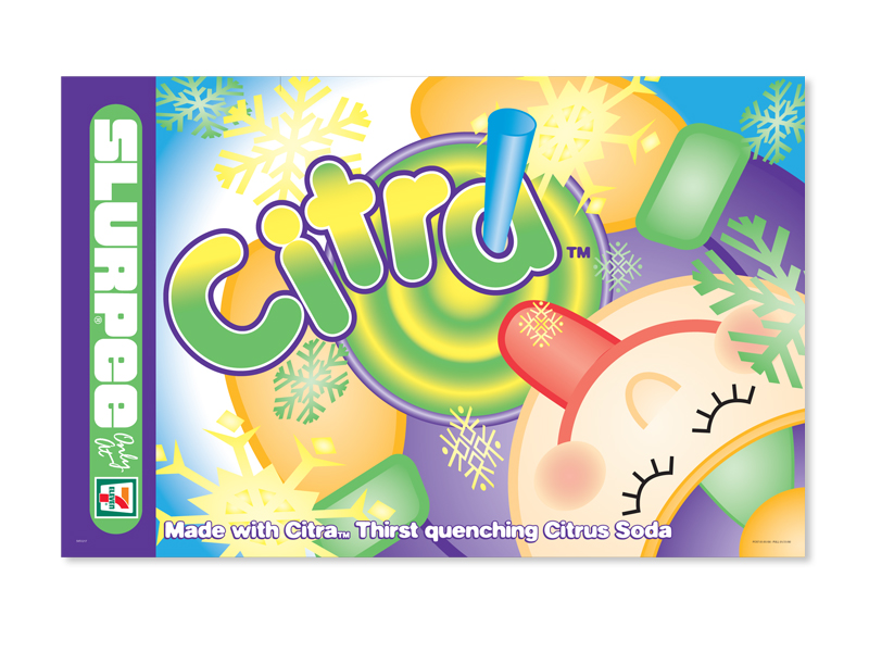
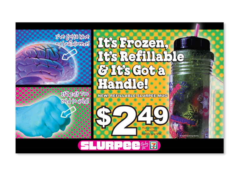
Slurpee® Machine Signage
Here are several examples of machine flavor cards and translite signs promoting seasonal and specialized Slurpee flavors.