Client: The Foundation
Category: Youth Mentorship and Fitness
Scope: logo design, brand design, swag, signage, identity package
Project Objectives: The Foundation, a Bay Area nonprofit, needed a logo that reflects the organization’s mission as well as the founder’s vision. The Foundation educates underserved youth about nature, fitness, nutrition and community through athletic programs. helping them reach new heights of fitness and personal growth. All-in-all the process took time, but in the end the client was ecstatic with the results. He really felt like the logo reflects the organization’s mission, and his vision.
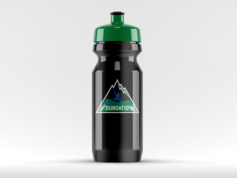
Water Bottle
Logo
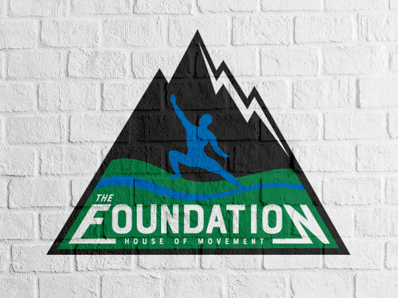
Wall Design
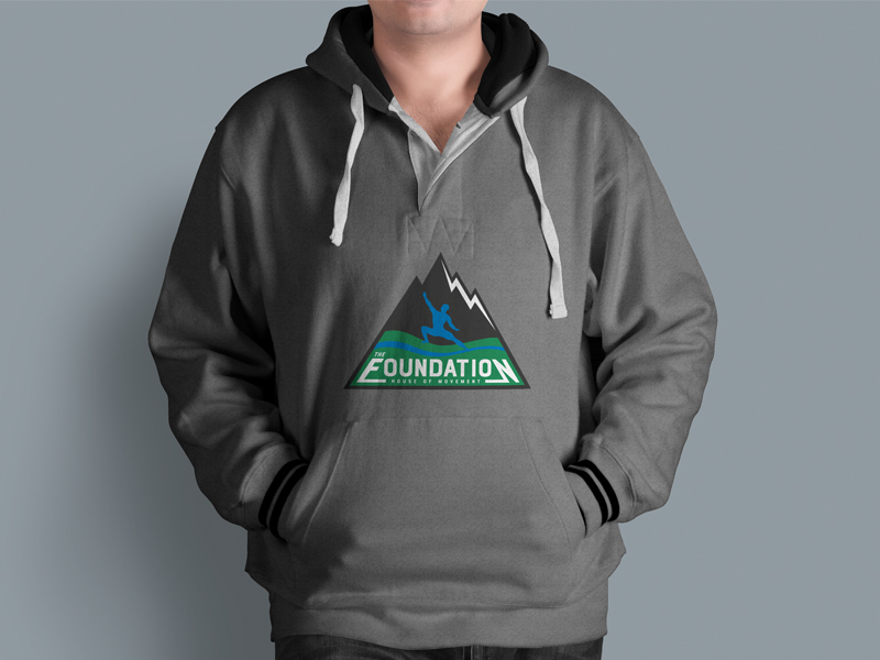
Hoodie
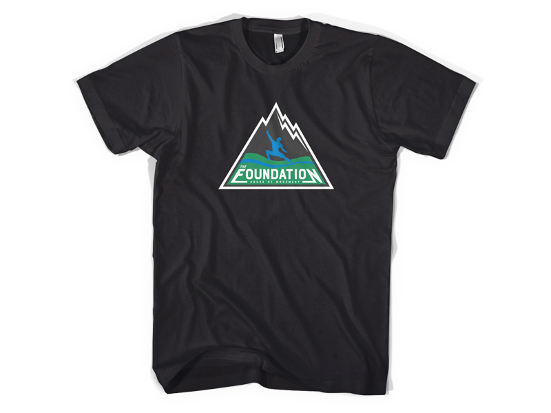
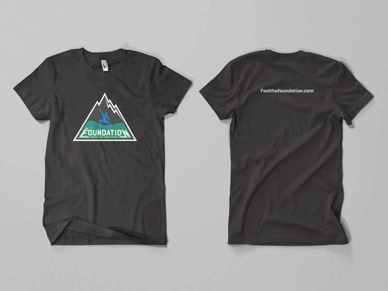
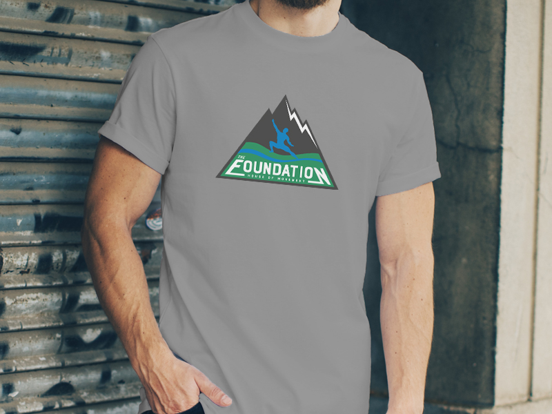
T-shirts
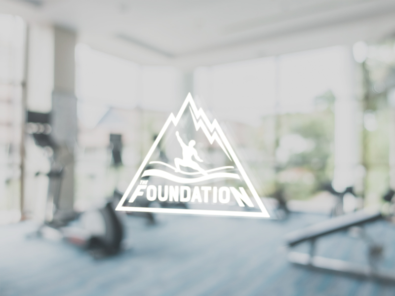
Window Decal
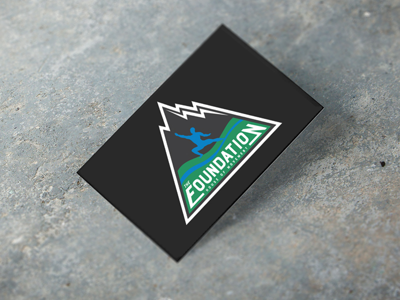
Business Card
’Berta’s Role
Working collaboratively with the client, ’Berta:
- worked closely with him to establish trust and a collaborative back and forth process.
- worked through many rounds of sketches in order to narrow down the concept focus.
- presented options at each round, giving solid rationales for not pursuing some client-driven options that wouldn’t work as well graphically.
- worked to guide the client through the design process, eventually landing on a logo concept that both she and the client were happy with.
- created a brand guideline and all versions of the logo needed for various applications.
‘Berta’s Process: Sketches
To kick off the project, ’Berta met with the client to gather more information about his vision for the logo. He was very specific about the vision he wanted to communicate and wanted to see specific concepts—often contributing his own sketches to the thinking. After the first couple of rounds, the mountain concept emerged as the concept to pursue further.
Logo Sketches
Berta’s Process: Logo Explorations and Iterations
’Berta explored several variations on the mountain theme with the client before landing on the final logo design.
This logo system for The Foundation needed to achieve several goals: reflect the organization’s mission and founder’s vision, appeal to youth, and replace a previously designed logo system that already communicated some of the same concepts, but in a different way. A Bay Area nonprofit, The Foundation educates underserved youth about nature, fitness, nutrition and community through athletic programs. They work with youth to help them achieve new heights of fitness and personal growth.
Logo Iterations
Black and White Logos