Client: The Pots
Mission: The Pots restaurant located in San Francisco’s Sunset district, was in dire need of a makeover from the interior decor to the logo design. ’Berta’s friend, a successful restauranteur, bought the existing restaurant from the previous owners and set about to make it her own—updating the logo, signage, menu offerings, and interior decor. The previous interior and logo were dated, so a fresh look and feel was long overdue. The timing was crucial, as during Covid, the restaurant needed to pivot to online orders and takeout.
Discovery and Strategy: ’Berta and the owner spent a lot of time thinking about the neighborhood where the restaurant is located, and brainstorming what would work during Covid in terms of low overhead, and high yield food offerings that would be tasty and appealing, but also be easy to make and take rather than relying on the original restaurant concept of a sit-down, boiling broth at your table model.
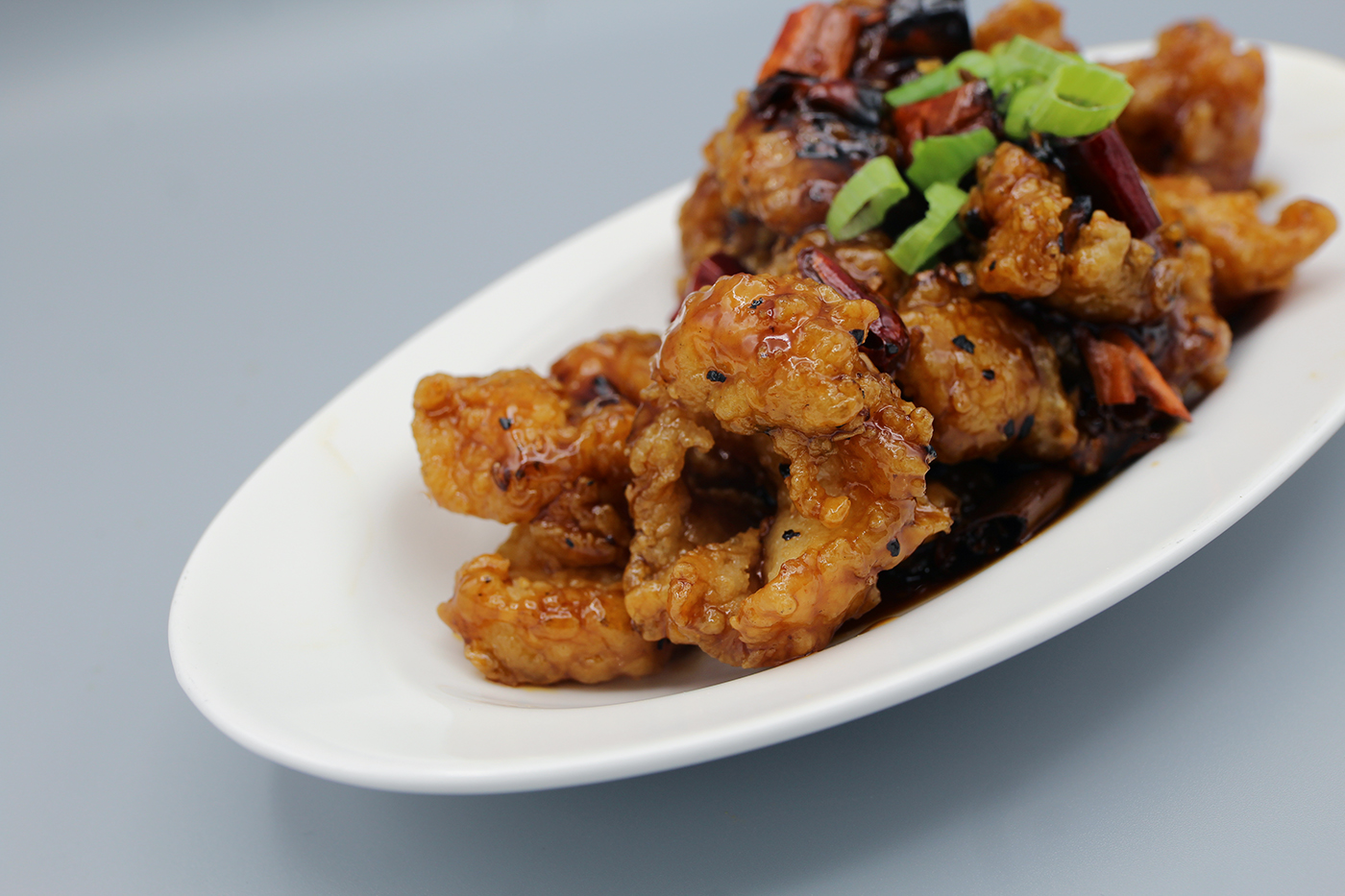
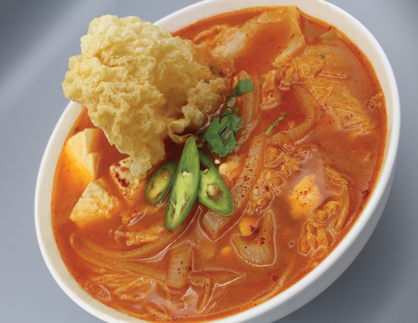
Flight Plan: ’Berta worked with her friend to put together a fast-track plan to rethink the menu offerings, including reshooting dishes, then test tasting them and giving feedback. It was definitely an iterative process that involved long hours and a lot of food. Normally, ’Berta would suggest a longer launch sequence, but given that everyone was scrambling during that time, it was about adapting on the fly.
Launch and Results: The restaurant was able to relaunch and eventually pivot back to their core of hot pot, but they were able to survive Covid and keep the doors open, which is not the case with all restaurants at the time. They have been a fixture in the Outer Sunset neighborhood for many years, and will continue to be for many more.
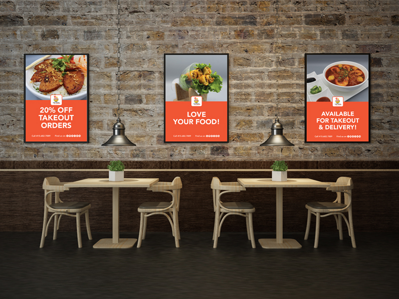
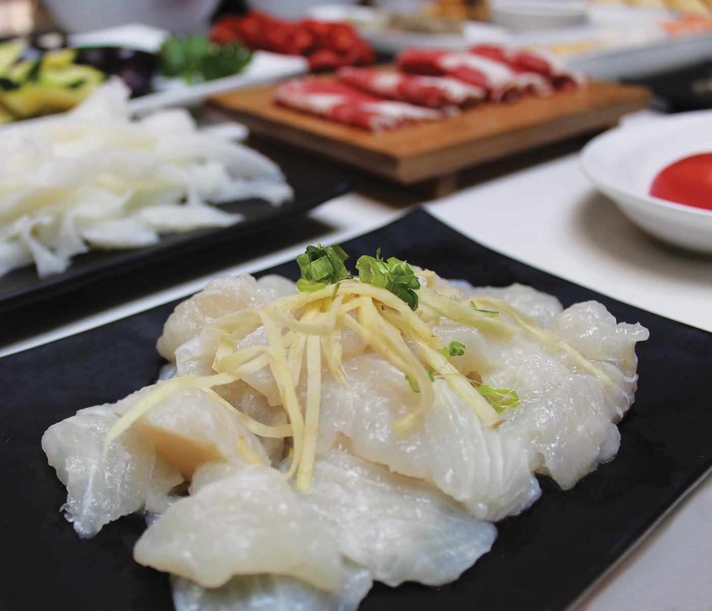
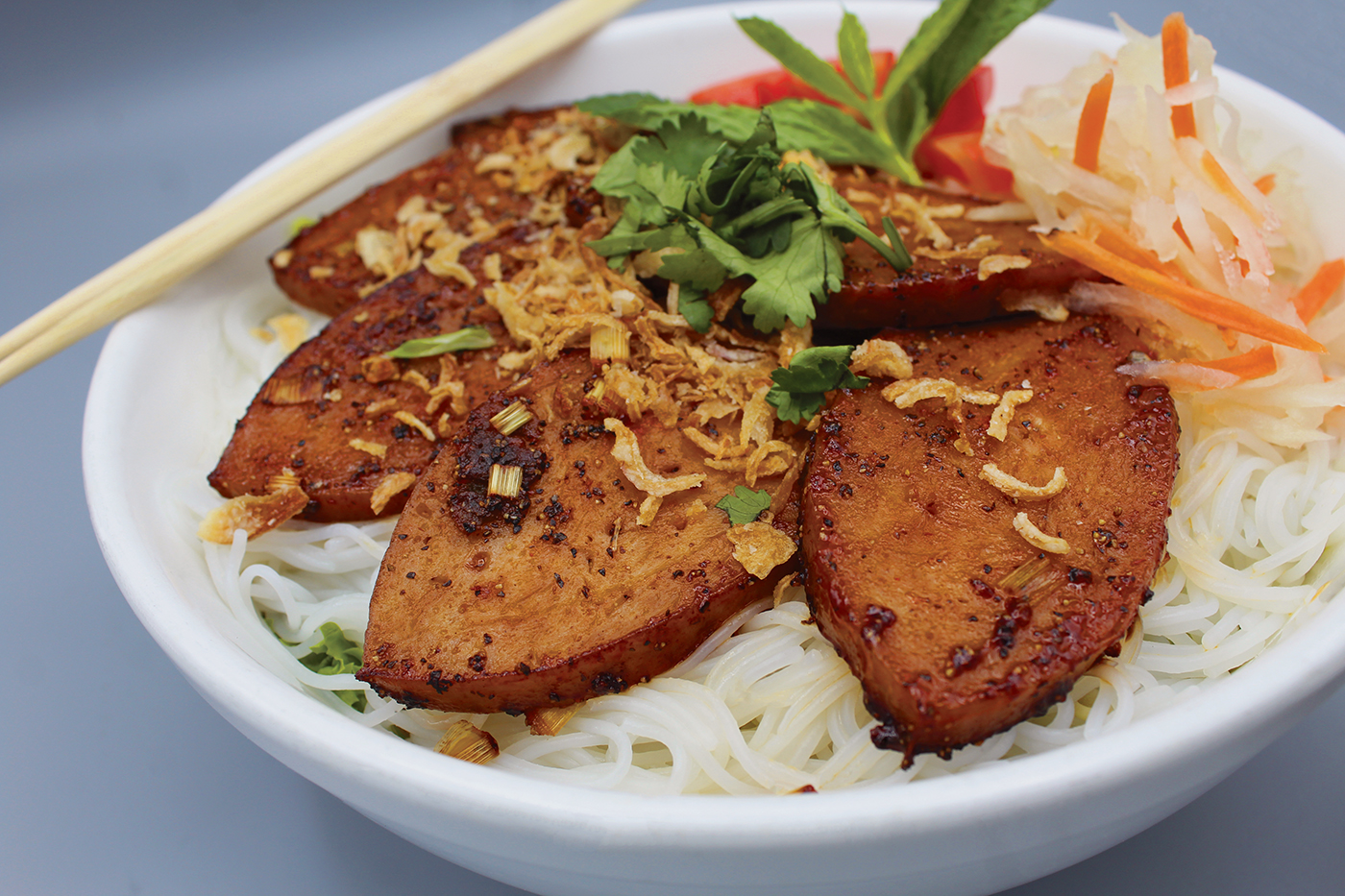
Historically doing a robust business, the Covid-19 shutdown greatly effected the restaurant’s ability to maintain sales. The restaurant normally features a “hot pot” model of dining, but the takeout model didn’t lend itself to this style of food, so the owner had to reinvent the menu to include dishes that are easier to package for takeout. As a result of the work ’Berta did on the visual design and branding, along with the menu retooling and increased online outreach, sluggish sales at the restaurant started to pick up. Improved food photography, a clearer menu, and more impactful visuals helped draw in passersby and increased online ordering.
‘Berta’s Role
’Berta, using her skills as a branding professional and designer, quite literally “worked for food” and designed a logo and branded materials for her friend’s restaurant in an attempt to help increase foot traffic and sales. As part of the project, ’Berta:
- Considered the fact that her friend wanted to appeal to a wider clientele, including young people and kids.
- Considered the fact that the menu had shifted from strictly a hot pot style of dining to a more diverse menu of Asian fusion food offerings.
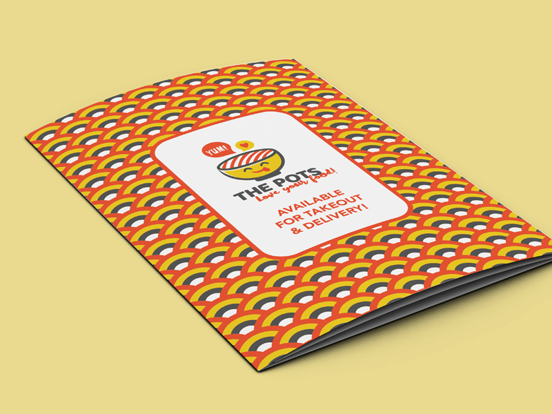
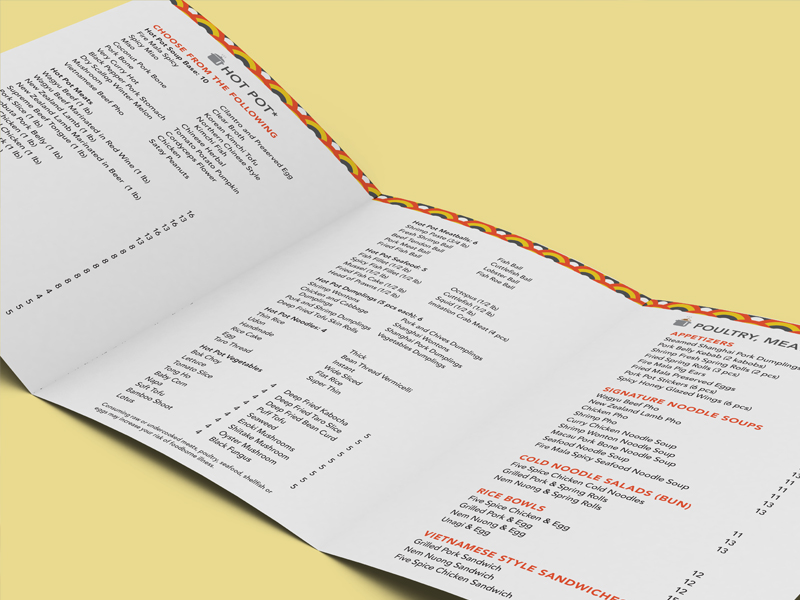
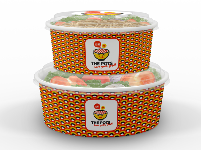
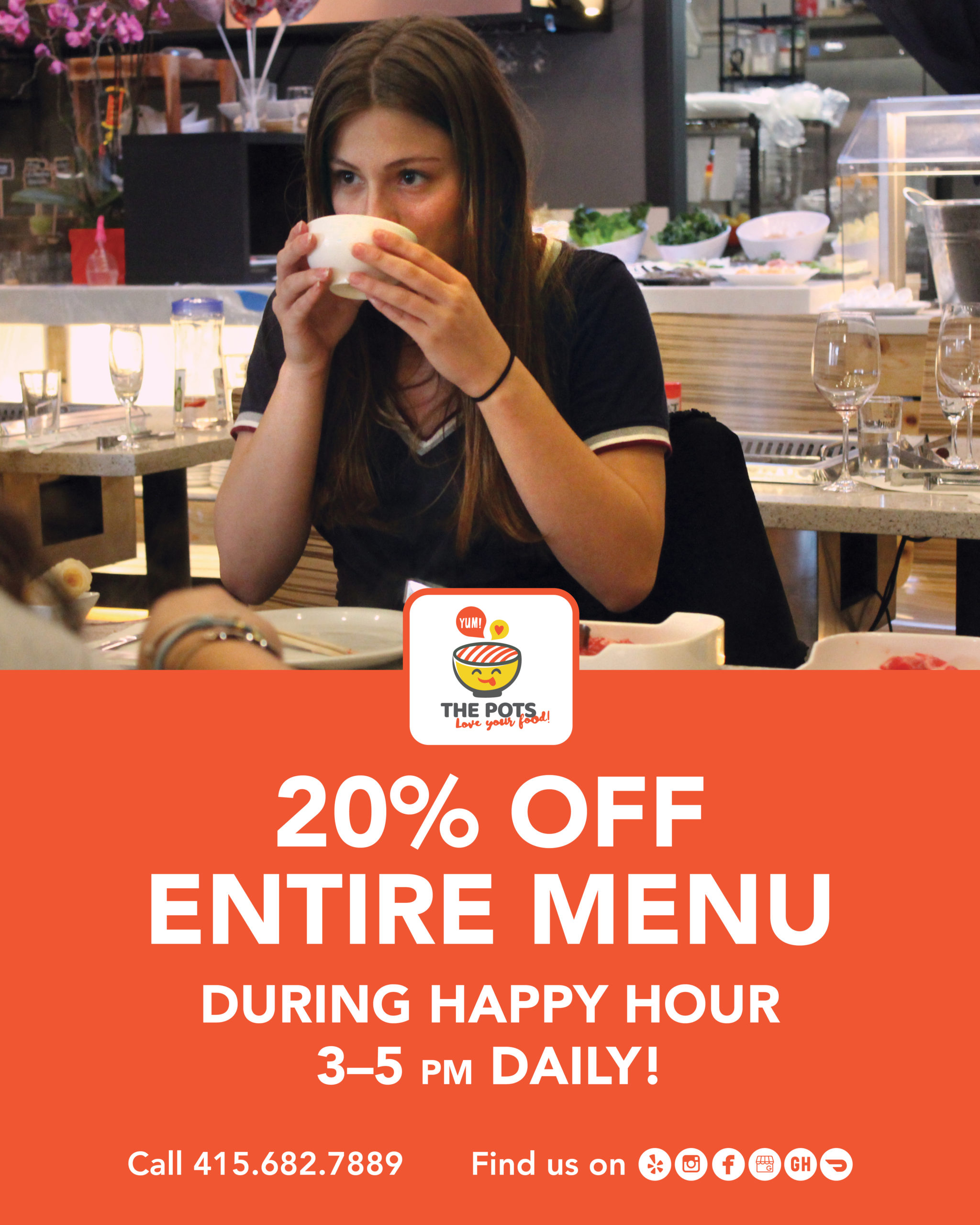
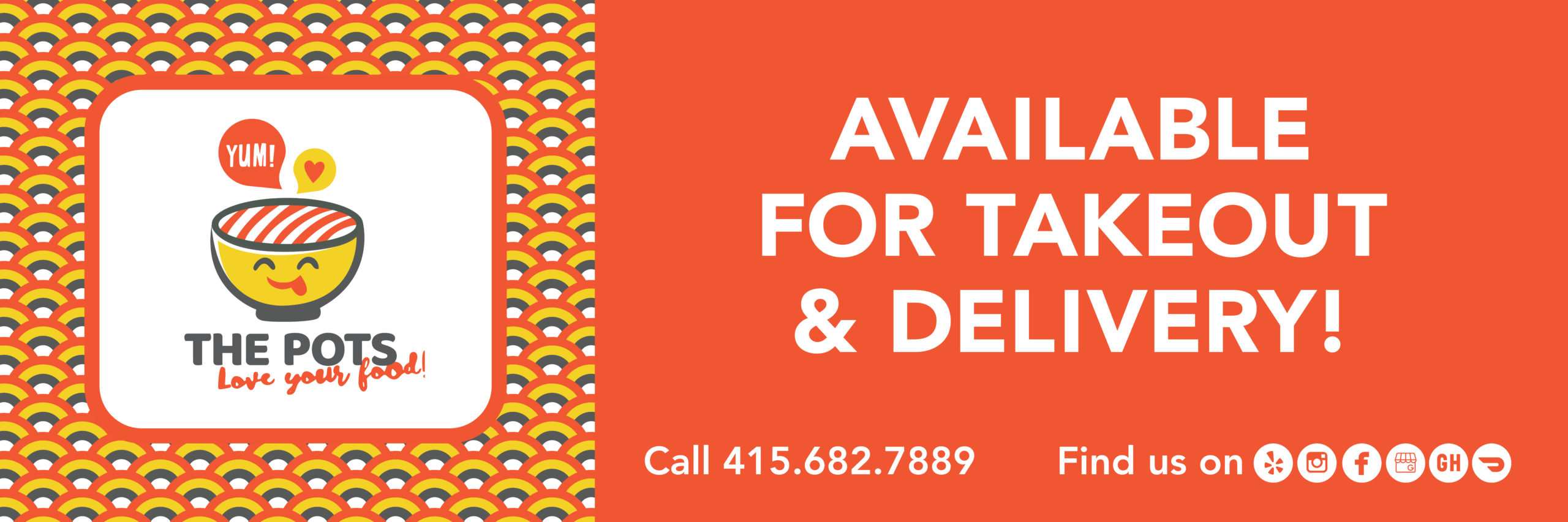
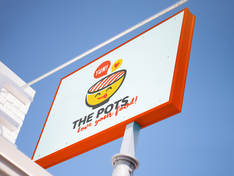
- Created a logo, signage, menu and other collateral that were boldly branded to appeal to customers eyes—as well as their stomachs.
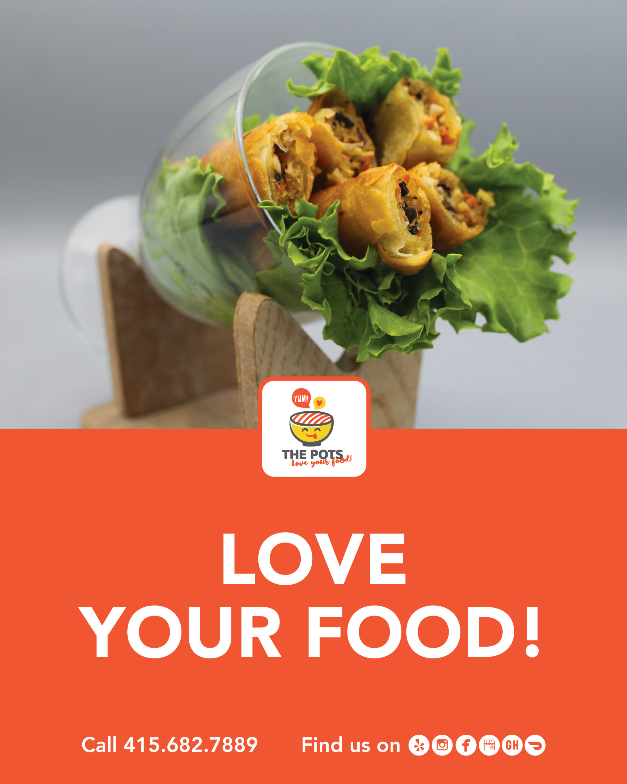
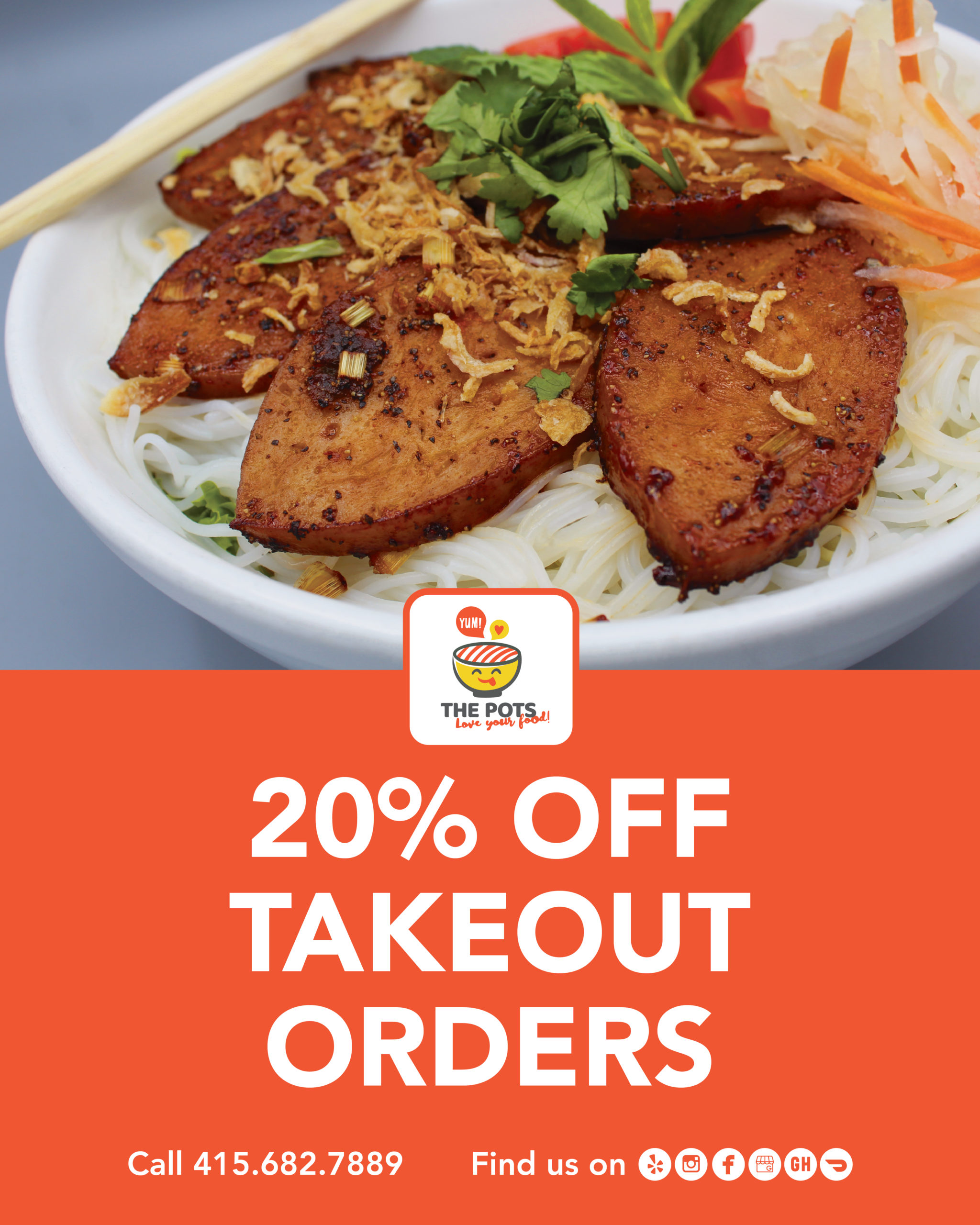
- Channeled her years of experience art directing photoshoots (including shoots for food photography) and set up a shooting tent, personally taking photos of various dishes and doing the retouching.
- Provided insight and consulting into social media strategies, including modeling online descriptions.
- Word-smithed the menu, poster copy, and other wording to clearly communicate to customers.